
 |
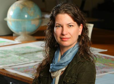
| Jennifer Grek Martin teaches the new cartography class. (Nick Pearce Photo) |
With more than 3,700 classes on offer at Dalhousie, it's hard to keep track of changes in the course calendar. This week, we take a look at classes added recently to the undergraduate calendar.
"How Global is your social network?" Twittermap.tv knows: the site will map your Twitter followers on their respective locations across the world, so you know just who in the Philippines is also nuts for Mad Men and who in Morocco cares what you had for lunch.
But take a closer look at the "world" you and your cronies inhabit. The map’s constructed according to the "Mercator Projection" – a navigational cartography system devised in 1569 – and your friends in Greenland now live in a country the size of Africa.
Greenland hasn’t grown. It’s just that there are myriad "correct" ways to represent geographical data on a map, and devotees choose one. "While something may be scientific, it may not be (objective)," explains Professor Jennifer Grek Martin, who is teaching this fall semester’s new class GEOG 2000: Cartography.
Contentious colour
Part of the problem is the issue of "projections" – strategies for representing our three-dimensional planet two-dimensionally. But disproportionately large land masses aren’t the only societal biases visible on maps. "The use of colour has very high cultural context."
While many Western maps use the colour green to indicate forest, for example, Islamic countries refrain from the indiscriminate use of green due to its religious significance. Creating a map accessible to, and readable by, all societies is a challenge — Prof. Grek Martin’s favourite example is Harry Beck’s 1933 "map" of the London Underground. You’ve probably seen the colourful diagram of lines and dots he created. From a strictly spatial point of view, it’s wildly inaccurate. Yet it gets you where you’re going: a success.
Prof. Grek Martin is well suited to her subject. She works in the Killam’s Map Collections room, where Dalhousie houses more than 70,000 maps, and admires the way cartography combines science, art, and text. "I’ve always been really fascinated by both artistic pursuits and scientific pursuits... trying to blend those two things is sometimes pretty tricky."
She fully intends to blend them, which will make GEOG 2000 unique among other cartography courses: "Most cartographical courses are taught (either) from a historical perspective completely... or as a design course."
Students in cartography will begin their studies with the cultural history of mapmaking. "There are myriad different kinds of maps, in every culture, every historical period. And they’re all going to be different," Prof. Grek Martin explains. "Any society that wants to communicate any spatial information makes maps."
'Visual creatures'
Some are virtually unreadable to the Western eye. "Stick charts" from the Marshall Islands and Carolina Islands, used to chart ocean currents, are made by tying twigs together in intricate—and, to the uninitiated, incomprehensible—patterns. A map of New France from 1657 seems less interested in terrain and distances than graphic renditions of the perils awaiting travellers. A Hindu cosmological globe maps not only space but the Hindu "religious-spiritual worldview."
Prof. Grek Martin’s expertise in the Map Collections will prove useful as students explore Dalhousie’s collection firsthand, examining maps from a wide range of times and cultures, including an ornate road map of Luxembourg with unusually detailed topography, a ‘60s-era political map of China by a Swedish/Hungarian firm, and a 1941 military map of Egypt. After observing and analysing extant maps, students will then undertake their final project: creating a map of their own. As GEOG 2000 is not a lab class, students are not required to use GIS (Geographic Information System) software. Some may even elect to submit hand-drawn maps, in a rather nostalgic echo of school years gone by.
Even the word "cartography," has a slightly dated ring: Professor Grek Martin believes the digital age has changed the way we read and make maps. "In the old days, it used to be the purview of the very few." The declining specialisation of mapmakers has had unsettling results, she suggests, citing the case of a North Korean map which charted the distances which missiles could travel. The actual data was disturbing — if you could read it. But the "projection" the map used made the weapons appear deceptively short-ranged.
As in the case of the inflated Greenland, how many people reading the map noticed? "We’re visual creatures," says Professor Grek Martin, "But we’re not very critical of what we see."
Comments
comments powered by Disqus